
Designing a large commerce platform isn't just about creating more screens, it's about keeping every screen connected through a consistent experience.
Rather than starting from scratch, I worked with an existing e-commerce structure and focused on improving what mattered most: visual hierarchy, reusable components, and consistency across the entire product.

The challenge was deciding which familiar patterns deserved to stay, which could be simplified, and where thoughtful redesign would have the greatest impact.

Trust Before Promotion
For an organic grocery platform, credibility influences purchasing decisions. I prioritized a trust-first homepage that establishes confidence through lifestyle imagery and brand messaging before introducing promotional content, creating a stronger first impression for new visitors.

Balancing Speed and Depth
Quick View supports rapid browsing for everyday products, while the dedicated product page provides additional context including reviews, product information, and related items for more considered purchase decisions.
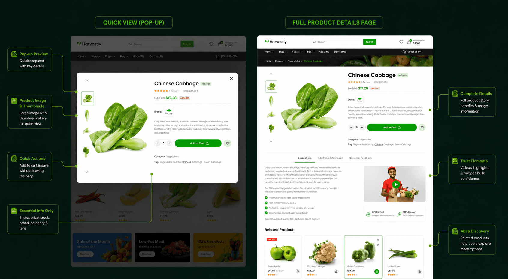
Two Ways to Manage the Cart
Rather than combining every interaction into one interface, I retained both experiences. The cart drawer supports quick confirmation without interrupting browsing, while the full cart page provides space for quantity updates, coupon codes, and order review before checkout.
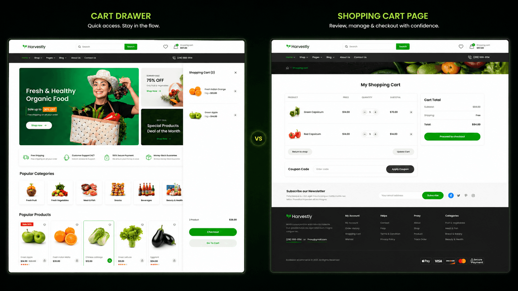
Designing for Consistency at Scale
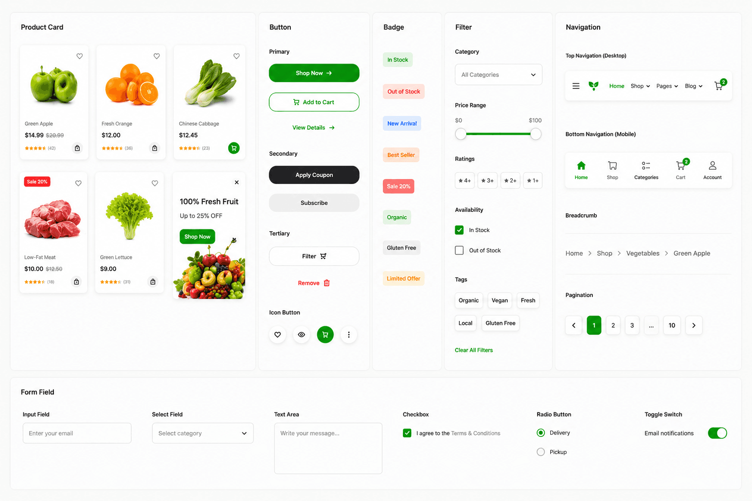
As the interface expanded across 55 screens, maintaining consistency became a priority. Standardizing reusable components reduced visual drift and created a cohesive experience throughout the platform.
Design Exploration
Instead of starting with user research, I explored multiple homepage layouts to understand how different merchandising strategies shaped the shopping experience. Rather than representing visual variations alone, each layout reflected a distinct merchandising strategy.
Curation-forward — Highlights curated product collections like Hot Deals, Best Sellers, and Top Rated, allowing the store to guide product discovery.
Self-service — Prioritizes browsing through filtering, categories, and search, giving shoppers greater control over exploration.
Trust-forward — Leads with lifestyle imagery and brand credibility before merchandising, helping first-time visitors build confidence before making purchase decisions.
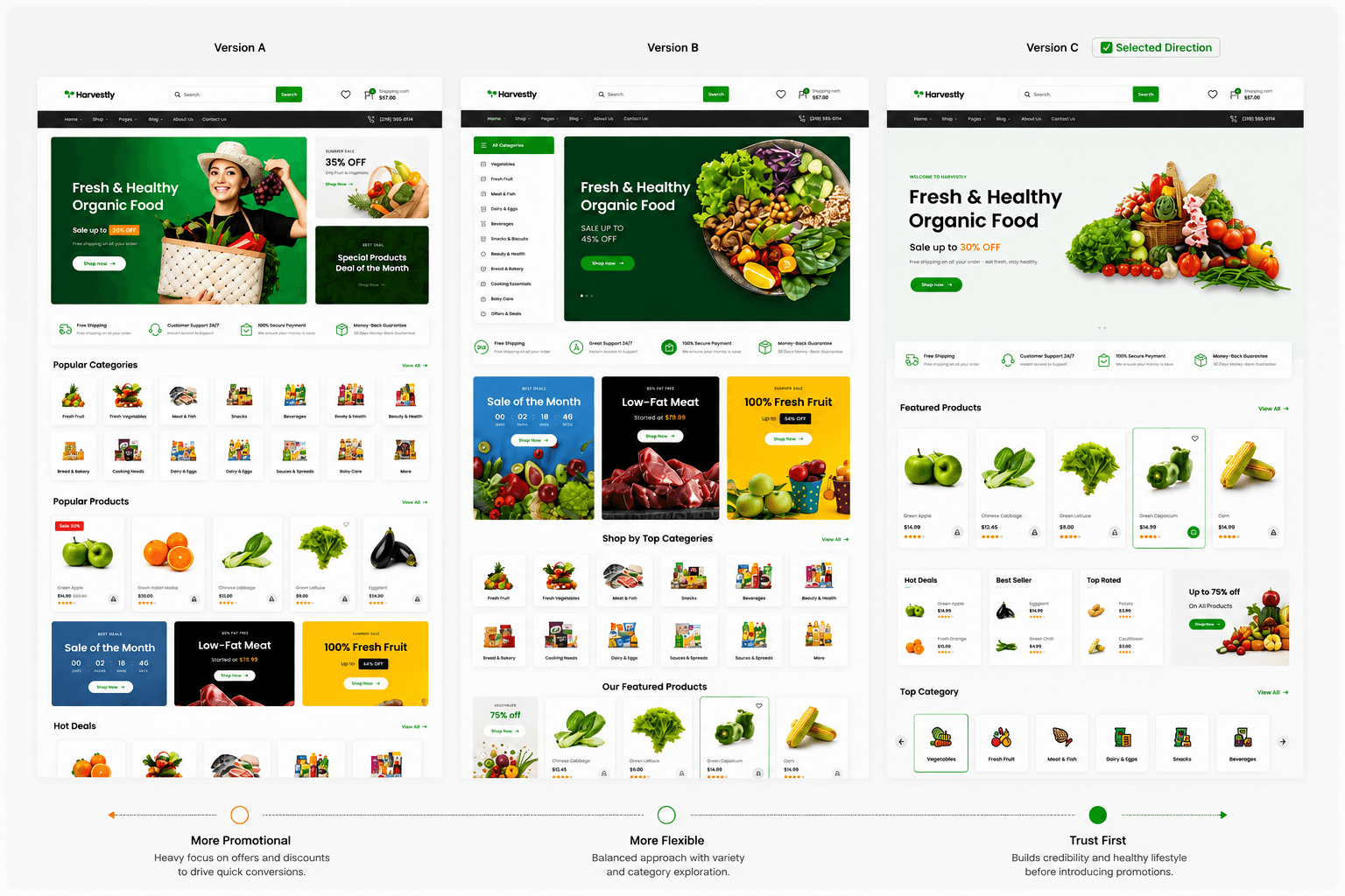
Key Insight
These layouts represented more than visual variations they reflected different assumptions about user behavior. For an organic grocery experience, where trust and product quality influence purchasing decisions, the trust-forward direction created the strongest foundation for first-time visitors.
Design System
To ensure consistency across the platform, I refined the color palette, typography, iconography, and reusable components including product cards, badges, buttons, and filters—creating a unified visual language that scales across every screen.

If I continue iterating on Harvest, I'd revisit the homepage hero to better prioritize competing promotional content. While the overall system feels cohesive, simplifying the visual hierarchy could help first-time visitors focus on the most important message. More than anything, this project reinforced that designing at scale isn't about creating more screens it's about maintaining clarity, consistency, and cohesion as a product grows.
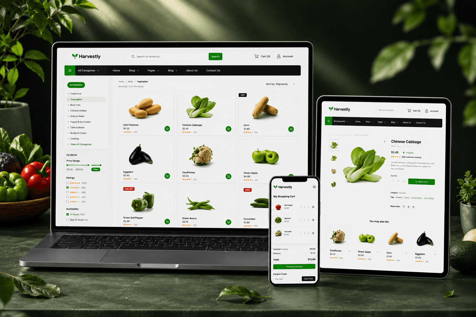
Harvest demonstrates my ability to design beyond individual screens and think in systems. By maintaining consistency across twenty-one interconnected pages, the project strengthened my approach to scalable UI design, component thinking, and interface hierarchy while reinforcing the importance of deliberate design decisions over unnecessary reinvention.
